

Red. How does that make you feel? Should you stop? Are you hot? Is there a warning? Perhaps it makes you feel national pride? What about the color blue? Are you cold? Soothed? Is it for a boy?
Besides the words “No” and the names for our parents, colors are some of the earliest concepts that we are taught as a child. Around the age of two my daughter was helping me at stoplights, informing me that “Green means go, Daddy!” These early teachings are ingrained in our brain and are used as visual cues when we encounter new information that we may not fully comprehend.
However, through training to become a scientist, practitioners are taught that when creating a graphic of data to showcase all the possible detail in the data. This is true as long as the colors and symbols that we use are consistent from graphic to graphic. Still, scientists are told, that when reading scientific papers or in an audience, to scrutinize the labels and x and y axes of the figure to see if they can draw the same conclusions as the author. Along the way, scientists become accustomed to looking at graphics for extended periods of time to discern the intended meaning and, if conducting a professional review, find flaws and gaps in the author’s logic. This is all part of the scientific process.
This training leads to a specific way of thinking which co-exists with those early teachings in a scientist’s brain, but problems arise when graphics made for scientific explanation are presented to a public audience. Without formal training, most individuals will base their judgments about images on those early lessons from childhood. Greens are good, reds are bad, blues are cold, pinks are for girls, and on and on.

Here at InFORM we try to balance showing the range of cesium concentrations that we have measured while still framing these concentrations in something that is meaningful, the level at which cesium concentrations become concerning in drinking water. Thus, we present all our data on this site with many shades of green at low concentrations, to highlight the observed variability, yellows in the middle, and finally red approaching the level of concern. After all, greens are good, right? These were all choices that we made at the beginning of the project to aid in public understanding of the data. But, they are all choices and arguments can be made that the colors should be changed, that while 10,000 Bq/m^3 is A level of concern, it is not representative of THE level that is thought to be harmful to humans, other animals, or plants. Therein still lies a choice and value judgement, the concentrations harmful for humans are different than those of other organisms. Which should be chosen?
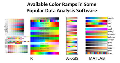 My point is, that data can be represented in a nearly infinite number of ways. Some popular data analysis software have numerous options for the user to choose from to best represent their data. Each color choice draws the eye to different parts of the data and may lead to different interpretation. A very common color spectrum, or ramp, to choose is the rainbow. Why? Because with all of those colors, it is rather easy to tell the reader to look to the purples for low values, reds for high values, and ooo…”did you notice the strange arrangement of the yellows? We weren’t expecting such a wide distribution of middle in that dataset.”

Late last year, Dr. John Smith presented recently collected InFORM oceanic monitoring data to a scientific audience of his peers. Given that everyone in the room had similar training in understanding oceanographic data, he used a rainbow color spectrum to highlight the various structures that were observed in the Fukushima plume as it approached the west coast of North America. To maximize the contrast and make it easy on the audience, he chose the highest concentrations to be red and the lowest contrast to be purple. This way the differences between figures in both time and space could be highlighted. As is common at the end of a meeting, the presentations were posted online.

Recently, ENENews saw this figure and without explaining to their readers the meaning or relevance of the units, asserted that a “Huge red blob of nuclear waste near shore”. This article was shared on Facebook nearly 1,000 times and likely had a reach on social media to nearly 250,000 people. However, nowhere in the article does it reference the level of concern (10,000 Bq/m^3 according to Health Canada) or otherwise aid their readers that human and environmental risks posed from this level of radiation is considered very low.
The exact same data are presented here in InFORM colours.

Do you feel the same about each image? Besides the colours, the reader will also notice that method used to interpolate, or calculate, the values outside of the data points is different. This again is a scientific choice that the author places on their data using the analysis software at hand. The method for interpolation used in the rainbow figure is perhaps a bit more liberal than the conservative one used in the InFORM figure, but neither is incorrect. The only way to evaluate the truth behind the assumptions made for these interpolations would be to collect more samples.
So, each time you are presented with data represented by rainbow colours, please be careful with your interpretation and feel free to ask for clarification. At InFORM we will try to make interpreting our data easier, if possible. While the colours do not change the fact that current cesium levels pose a negligible risk to human or environmental health, they do have the ability to change our perceptions.
Fun fact: Did you know that the radioactive processes in nuclear power plants give off light? The bright blue light is a result of Cherenkov radiation. So if anything should the public be scared when radiation levels are represented as blue? At InFORM, blue will continue to indicate “Not Detected.” 😀

